The year 2026 invites homeowners and interior designers to look beyond the classic white walls and explore a diverse palette of light colors that promise to ignite any space with fresh energy and subtle sophistication. While white remains a timeless choice for brightening rooms, recent trends champion soft hues that add personality and warmth without sacrificing light reflection. From pastel shades that whisper elegance to dynamic colors that shift with natural light, today’s palettes push the boundaries of modern living and home decor. This article unfolds the most compelling light colors revolutionizing interior design, offering practical guidance to transform your home’s atmosphere with ease and style.26 favor vibrant yet soft options.
Rethinking Light Colors for Interior Design: Moving Beyond Plain White
White paint has long been the go-to in home decor for its unmatched ability to reflect light and open spaces. However, the 2026 color trends urge homeowners to experiment with a richer variety of light hues. These alternatives, ranging from delicate pastels to neutral tones warmed with subtle undertones, not only uphold brightness but also inject character and modernity into interiors. Choosing a light color that introduces personality without overwhelming the room is the new art form.
For example, light blues and soft greens have become favorites for lending a tranquil, spa-like atmosphere, while creamy taupes and warm greiges provide a versatile backdrop that complements various furniture styles. This evolution aligns with the broader desire for spaces that are not only bright but also inviting and distinctly personal.
Discover more about redecorating with light palettes in trusted design guides that prioritize both form and function.
Advantages of Choosing Light Colors Other Than White
- Softens the atmosphere by avoiding the starkness often associated with pure white.
- Enhances warmth and comfort, making rooms feel more inviting.
- More forgiving for imperfections on walls or architectural features.
- Allows for creative pairing with furnishings and textiles through complementary undertones.
Color Palettes That Transform Bright Interiors in 2026
Light colors that interact with natural or artificial light to shift subtly in tone introduce a dynamic quality to interiors. Known as dynamic paint colors, these hues create an ever-changing backdrop perfect for modern living spaces, appealing to those who seek constantly evolving environments. For instance, a wall painted in a shifting sage green may appear deeper at dusk and almost luminescent in the morning.
Integrating such colors requires a deeper understanding of lighting conditions and space usage, but this complexity rewards with extraordinary aesthetic richness. Homeowners eager to experiment can also mix these colors to balance warmth and coolness, thereby personalizing the room’s mood throughout the day.
Explore dynamic color trends for how light changes your perception and how to master this effect in your area.
Key Tips for Successfully Using Dynamic Light Colors
- Assess natural light sources: note how sunlight enters and moves through your space.
- Test paint samples at different times of the day to observe color behavior.
- Pair dynamic colors with neutral furnishings to avoid visual clutter.
- Use accent lighting to highlight shifting hues during evenings.
Pastel Shades to Refresh Your Room Transformation
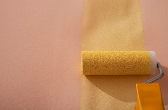
Pastels remain among the top picks for those wanting to brighten interiors gently and with a fashionable twist. Unlike bold colors, pastels offer versatility and a subtle presence that harmonizes effortlessly with contemporary and classic decors alike.
Soft lavenders, blush pinks, pale yellows, and mint greens can foster calming spaces ideal for bedrooms, living rooms, or dining areas. These shades support a light, airy feeling perfect for limited spaces, enhancing the flow of natural light while adding character.
For detailed insights on light hues that maximize natural illumination, consult expert advice on how to optimize your light colors for each room.
How to Choose Pastel Colors for Your Space
- Consider the room’s orientation: warmer pastels suit north-facing rooms; cooler shades favor south-facing.
- Complement pastel walls with textured fabrics or metals for depth.
- Use pastel shades as a base for layering richer tones in accents like cushions or rugs.
Light Colors for Every Room: A Comparative Table
| Room Type | Recommended Light Colors | Benefits |
|---|---|---|
| Living Room | Sage Green, Soft Gray, Blush Pink | Creates welcoming, peaceful ambiance; versatile with furniture |
| Kitchen | Warm Cream, Light Aqua, Pale Yellow | Brightens space; stimulates appetite and energy |
| Bedroom | Lavender, Light Blue, Dusty Rose | Promotes relaxation and calm; suitable for rest areas |
| Bathroom | Pale Mint, Soft White, Light Taupe | Evokes cleanliness and spa-like tranquility |
Each of these choices aligns with current color trends that redefine how room transformation is approached, balancing style and functionality in every corner of the home.
Understanding the nuances of light colors illuminates critical design decisions that influence comfort, style, and mood across living spaces.